DenseLayers is a website where people can discuss research papers online, paragraph by paragraph. It is the project I am working on right now, and aim to launch the site by Dec 31. The story of how it came about etc is quite long, but essentially it started with me explaining the AlphaGo paper on Medium. I’ll skip to a more pressing matter – what features should be in the first version of the website. As always, don’t mind if this turns into a rambling post towards the end.
***
As per my philosophy, my first version should have the following qualities:
- It should solve a pressing problem at least 4x better than what people do currently.
- Doesn’t matter how much friction there is, as long as it solves that problem better than the alternatives.
- It’s a proof of concept – a “test”. As a Systems Engineer, I’ve been taught to believe that a good test tells you not just what’s wrong, but also what to do. This means there should be some way to collect feedback (=data) from the MVP.
- It should be as intimate and unscalable as possible without becoming a pain in the ass for me. I want to be as close to the website’s users as possible, but don’t want to be overwhelmed. So I need to decide what should be automated and what shouldn’t.
So here it is: the list of features in V1.
Front Page
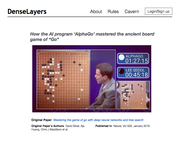
This page doesn’t need to be flashy. Understanding DenseLayers’ purpose is not rocket science, so I don’t need to put effort into explaining something that’s obvious. For nostalgia, here’s how the site will look in its first iteration (this is a screenshot of what I’ve actually coded up built).

1. The front page should have a list of all papers currently on the website, ranked in some way. These list items should have some info about the paper, as well as a link to the full paper’s place on the website.
2. Navigation links at the top of the page: About and Site Rules are a must. Also Login/Sign up.
User accounts
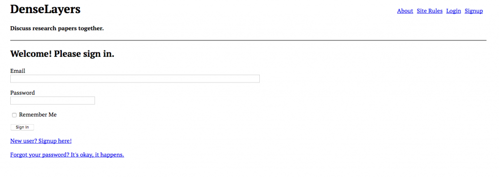
Users can sign up, login, log out, remember password, forget password etc. I’ll talk about user anonymity and privacy later. Users shall also have a profile page where they can have a little bio and contact etc. Nostalgia:
Single paper display
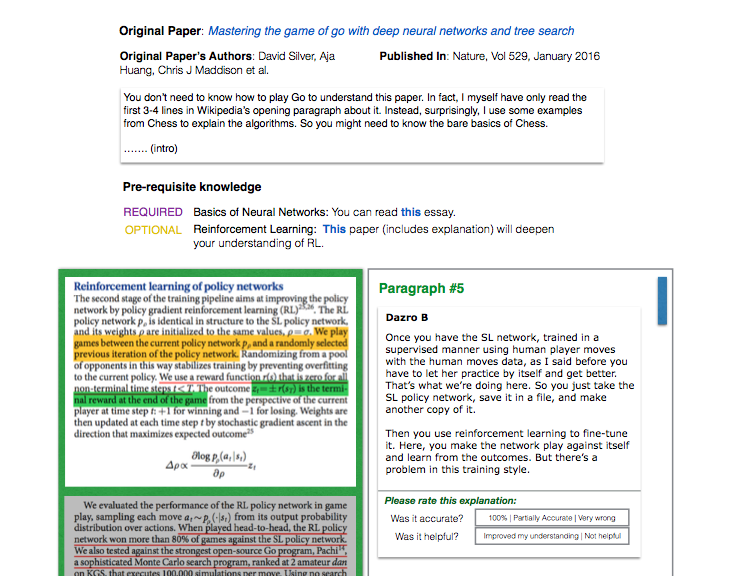
1. Users can read the whole paper, broken into individual paragraphs that I’ll call “fragments”.
2. Users can add and delete their own explanations for a particular fragment. Each fragment will have its own comment thread that opens when you click it.3. Users can also leave comments on the overall paper (not just individual paragraphs). (I’ve decided it’s not critical)
4. Users CANNOT comment on someone else’s post/explanation. No need. I don’t want good thoughts to be buried inside long nested comments. The only thing you can do is write your own post.
5. Don’t display users’ name on the paper page (!!). Give users a random temporary name or a pixel art thumbnail. Users can only see their own names.
6. Users’ profile pages can be opened however, if someone clicks on their pixel art/random name.
7. Users can vote on paper fragments that are particularly unclear and need more discussion/explanation. This will help direct the community towards parts of the paper that are particularly unclear, thus stimulating more productive discussions (“bang for the buck”).
8. Users CANNOT tag or “@mention” other users in their explanations or comments.
Here’s a wireframe of what it might look like. Interestingly, I made these wireframes more than a year ago and now finally sat down to build the damn thing!
Data Collection and Metrics
I think it was Peter Drucker who said that what gets measured, gets improved. But I don’t yet know what overall metrics I want to be looking at – at this stage, the purpose is not “growth”, but rather having a site that I can show to users and get in-person feedback by watching how they use it, so that I can improve the product. So I’ll only spend the bare minimum of my time on setting up vanity metrics, at the acceptable risk of not being data-driven enough. I can always add all those analytics packages etc later.
1. Definitely collect information about how many views a paper has.
2. Also collect some user visit data. Now, what should count as a “visit”? I’m interested in seeing how “active” the site is, and at what times the website is most active. So essentially, every time someone loads a page on the site, I’ll consider it a “visit”. It can always change later. Interestingly, this definition did change later :D. I am now defining a “visit” as a user visiting a paper on the site, and not just any page. The only visits that are important are the ones when people are reading papers!
Spam
Steve Huffman to the rescue! His lectures on spam were a lifesaver, without which I’d be totally lost. The key idea is that just by being familiar with the motivations and behavior of spammers, you can fix a LOT of things without technical wizardry. So here’s what we’re gonna do.
- Check a time difference between a person’s consecutive posts. If a person is posting new stuff within less than 2 minutes after the previous one, it’s likely that either they are posting ads, or they didn’t put much thought into what they are saying. I don’t want DenseLayers to be a place where people talk mindlessly. So if you post within 2 minutes of your last post, I’ll stop you there and ask you to slow down.
- If someone includes a link within their comment, I’ll add an attribute
rel=nofollowso that search engines don’t follow the link. - Every time someone shows spammy behaviour (posting too quickly, or being flagged by the community), increase their account’s spammy count (this score will be invisible of course). Keep a threshold above which a user is certainly spammy. If someone is very spammy, log them out of their account and ask them to contact me personally. In future, I might not even let them know that they’ve been flagged – I’d just restrict their ability to post stuff on the site. It’s called “security through obscurity”.
Internationalization, Localization, Accessibility
The very fundamental premise of DenseLayers is to open up access to scientific discussion for everyone, all around the world. So it goes without saying that people should be able to write comments and explanations in the language they prefer. In the first version of the website, I won’t localize it to different languages. However, people can add comments in whatever language they prefer – I’ll try to make sure the text is in Unicode and doesn’t break on different browsers and the database stores their words without corruption. There will be no other accommodation, I’m sorry but I have limited time.
As for accessibility by people who have disabilities, I cannot really include many features but I will try to build the front-end using best practices that make it less painful for them.
I’d also love people with poor internet connections to use my site. The paper pages will be very heavy on images, but I will try to reduce the resolution to an optimal number, so that the file sizes are as small as possible (that helps with data storage costs as well, so it’s a win-win). I’m also flirting with the idea of not using any front-end frameworks, and instead just creating my own mini framework to use for V1. That should make the site leaner and simpler (although for future versions of the site, it’s a trade-off. I might give in to learning and using a popular framework like React or Vue etc).
Critical Decision: The front-end won’t be super responsive. At this stage I don’t need people to use Denselayers on their phones on the subway. I’d prefer users using it on a big screen and a proper keyboard.
Anonymity and seating at the table
Now comes a sensitive topic that I’m sure people will have differing opinions about when the site launches. Let me document my thought process here. The core premise of the website is openness. DenseLayers will be a judgement-free, hater-free and crap-free space. I’ve also decided that I want ideas to be given weight based on merit, and not the person’s credentials. This means that if a college freshman has an interesting point, it should be taken seriously. And if a professor emeritus says something stupid, it shouldn’t be accepted just because of authority. I believe that since the research community is tight knit, if you’re scrolling down a paper on DenseLayers and see 10 people leave comments here and there, you’ll probably already know 7 of them personally and 3 will likely from your own department. In such a scenario, it’s easy to disregard someone’s comments simply because they haven’t “earned a seat at the table”.
Let me be clear: nothing would piss me off more than that. So I’ve decided that even though users can have their own profile pages, their names won’t show next to the things they write. I’ll give each comment a different random pixel art thumbnail and that’s it. If a user does want to see the person behind a comment, they can click on the thumbnail and see the person’s profile page where they can see the person’s identity. This may sound self-defeating but it is not. I want people to be recognized, but only if their comments are particularly intriguing in some way. My hypothesis is that the friction will create a healthy balance between meritocracy and anarchy.
Alas, this means someone who just wants to troll, is also welcome on the site. So I’ll have to add other mechanisms to the site to keep trolls in check. In the future, every comment will have options that allow people to flag them for spam or douchebaggery. Too many offences, and a user is ostracized from the community. Unfortunately this feature will not be present in V1.
More importantly, culture always starts with the founder. To guide the culture on the website, I need to take the reigns in my own hands and show the example for what kind of comments I want people to leave. For V1, I will strive to be the foremost contributor on the website.
Another note on anonymity
Well, I was going to talk about a different feature that I planned to introduce later, but in this post I’ll keep it to myself. The gist is that a user who has particularly strong reasons to be anonymous (whistleblower situation), should be able to choose ONE paper per month that they will be completely anonymous on, so nobody can see their identity or visit their profile even if they click on the user’s thumbnail image.
Monetization?
Probably nothing, but a separate page where I list my favorite books (with honestly-shown Amazon referral links) might pop up later.
Technical Choices
Using Python/Flask for the backend, and using Flask plugins for almost everything. Mini front-end framework made by myself. Thinking of storing paper fragments on Amazon S3 and deploying website itself on either AWS Lightsail or Heroku.


