Staying true to the idea of documenting my journey in raw, unfiltered fashion.
It’s time to seriously start looking for a book cover designer for my labour of love over the last 12+ months. If I delay this any longer, my book may never get done.
Quick overview of the book
The book is titled “TECH FLUENT CEO.”
The working subtitle for the book is: The Eccentric Entrepreneur’s Guide to Leading and Innovating in the Age of AI
(Subtitle could also be: The Ambitious Non-Techie’s Guide to Leading and Innovating in the Age of AI)
It’s target audience is ambitious entrepreneurs, who want to build a modern, digital tech company or startup, but are non-technical — i.e they don’t have a background in software engineering or programming.
But they still need to hire engineers and work with them.
The book is about making them “tech fluent,” by teaching the concepts they need without having to learn to code, so that they can confidently communicate with engineers and strategize technically. So it’s like a non-fiction, educational business-technology textbook!
I want this book to enable countless entrepreneurs from diverse disciplines — arts, sciences, medicine, law, etc — to see their background as an asset, not a limitation, in their journey to build successful tech companies.
Who is the target reader?
Here’s the persona:
- X is a highly motivated, hard-working CEO / business leader. X has a get-shit-done, whatever it takes attitude.
- X wants to be very successful in life and in business.
- X is not a techie or engineer. X comes from a non-traditional background — could be anything from law to medicine, liberal arts, marketing, etc.
Design guidelines
First and foremost, I want a cover that pops — it is bold, eye-catching, and makes the person stop to look for a second.
Second, I want a cover that’s clear and authoritative in terms of fonts/typography. They need to see it as if the author wrote THE book on the subject.
Third, I don’t want a cover with too many elements crowding it up. It should be a work of art, yet unpretentious and simple. “Trying too hard” hurts credibility!
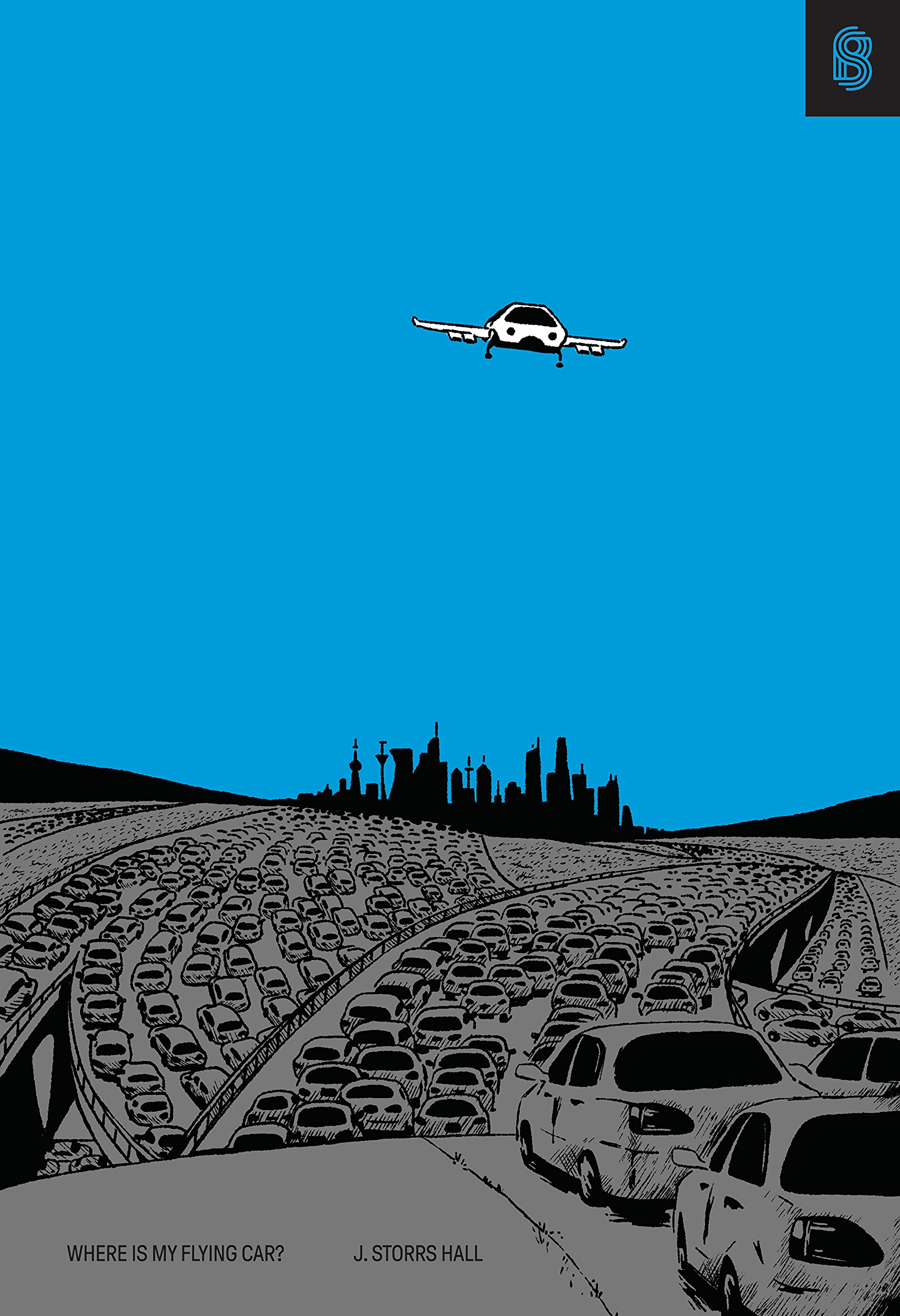
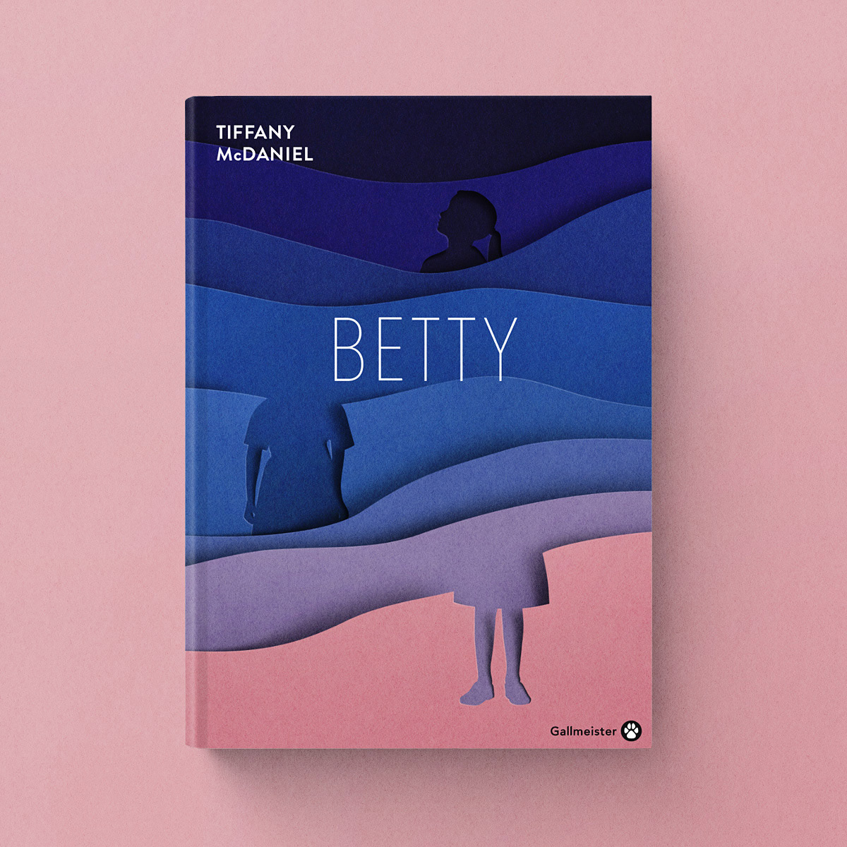
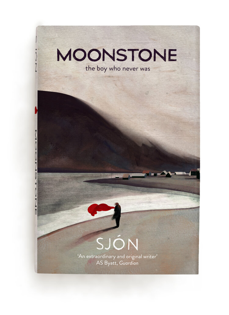
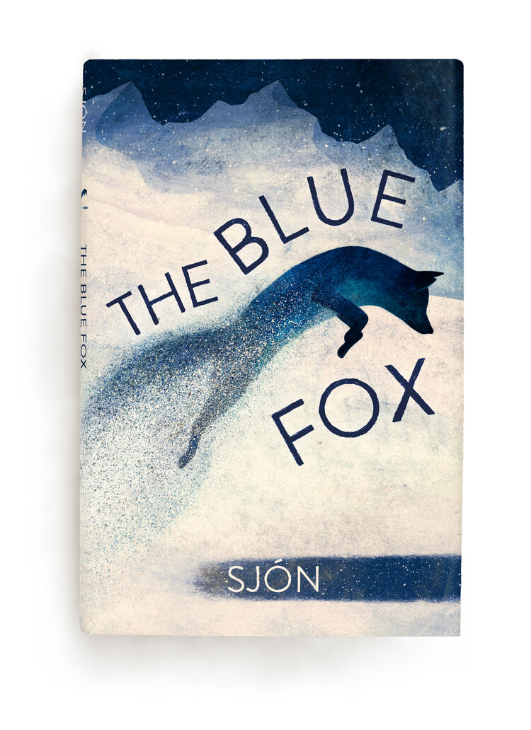
Here are some designs I’ve found that impressed me recently. In the first column, the two books are from Stripe Press, and the other two covers are by Eiko Ojala.
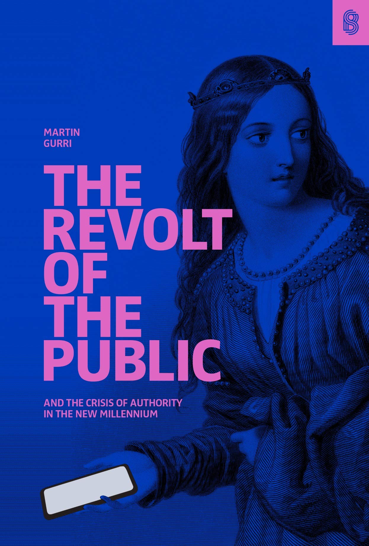
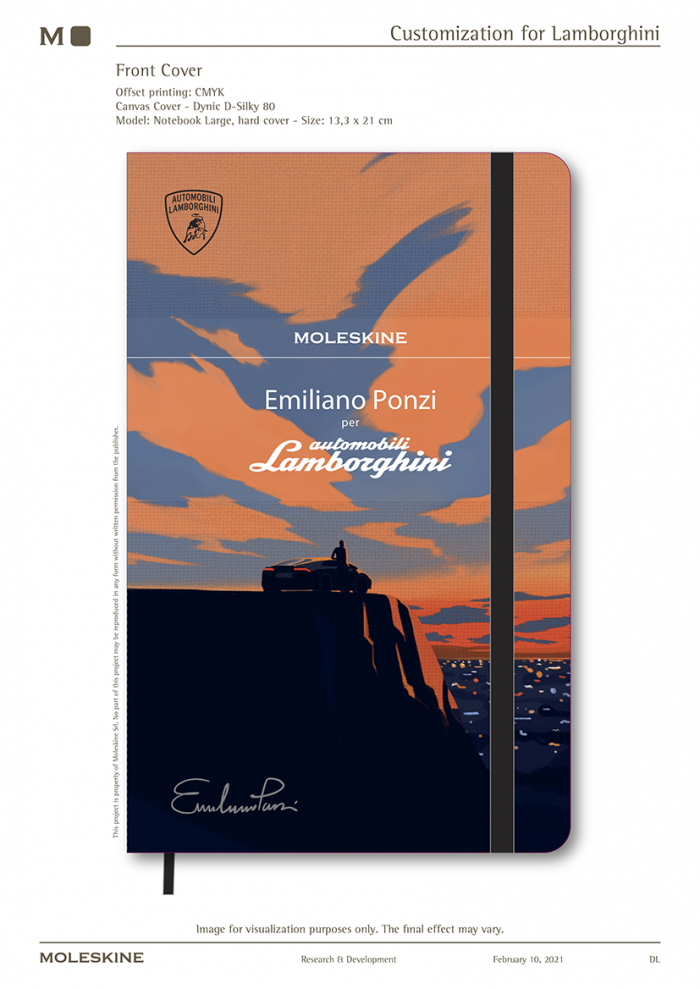
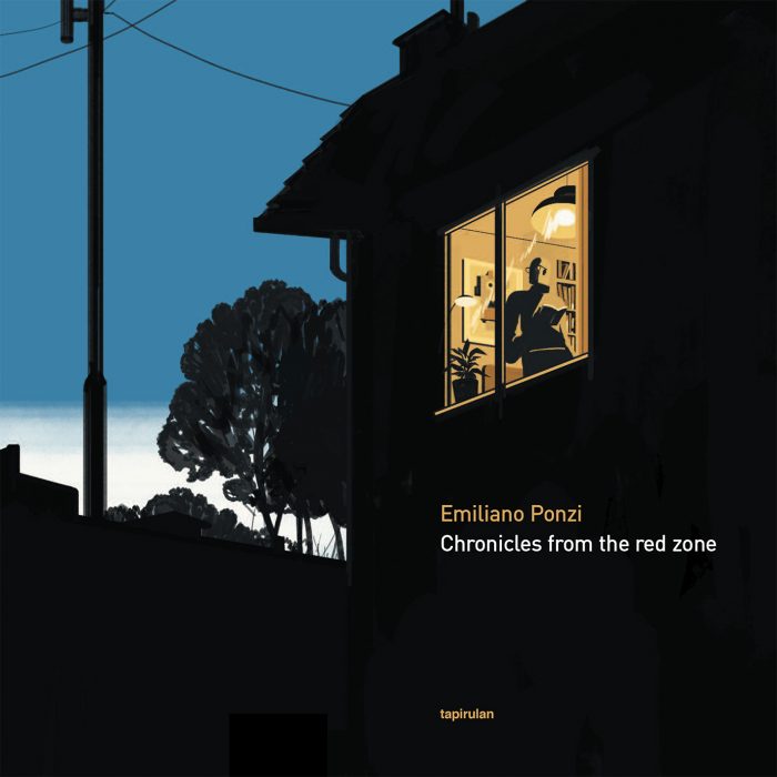
The cover “The Revolt of the Public” (shown below) is the closest to my original vision, especially in terms of title typography. It’s a great cover design, but I’d like the author’s name to be a little bit more prominent in mine. Another fantastic cover is the Lamborghini Moleskin design by Ponzi (also shown below).
A few things I don’t want:
- A design biased towards a certain gender of CEOs.
- Something cute.

Finally, everything by Emiliano Ponzi is beautiful. The Lamborghini cover is my favorite of all, for its understated but inspiring, aspirational nature.
Lastly, here are 2 gorgeous covers by Owen Gent. I like the way he chose color schemes and the art style, although it’s very fiction-based.
Here’s one final cover inspiration, which lacks any sort of imagery whatsoever but is extremely clever. Another detail I love about this is the blend of fonts, a mix of formal and informal typography that makes the book seem approachable without being casual:

What a designer could lead with:
I’ve chosen a few hypothetical directions for the cover, which might help! These are just suggestions.
- Use the paper-oriented style seen above for the cover?
- Focus on visual storytelling, with smart usage of space — to help with that, I can share with you the first two chapters which introduce my whole book.
- Use bold typography
- Colors should pop, but not overwhelm.
The last pointer for the designer is, please feel free to ignore everything I said and make a brave cover if you personally think it’s perfect. I won’t be mad I promise~